The brief was to create an interactive digital publication that demonstrated the national impact of the KPMG Foundation, the charitable arm of KPMG.
Working closely with the Foundation’s CEO, I transformed complex and relatively static content into an engaging and accessible visual narrative. The design centred on the concept of ‘impact’, using bold typography, striking graphics and clear infographics to communicate key messages and outcomes effectively.
The content was delivered within a carefully structured, screen-optimised PDF that incorporated intuitive navigation and accessibility features to support visually impaired users, ensuring the document was both engaging and inclusive.
This was a particularly rewarding project to work on, and I was delighted to receive personal feedback from the Chair of KPMG UK, who commented that the publication had itself ‘made an impact’ across the organisation.
Birmingham City University is proud of its role as a key contributor to both the city of Birmingham and the wider West Midlands region. This advertising campaign was developed to highlight the significant, yet often under-recognised, social, economic and educational benefits that the University brings to the region.
In terms of both scale and visibility, this was the largest advertising campaign ever undertaken by the University. The campaign featured an extensive mix of large-format print and digital media, including prominent 48-sheet billboard sites and a substantial network of digital 6-sheet displays across the Midlands, extending as far as Derby.
The result was a high-profile regional campaign that reinforced the University's commitment to the communities it serves and significantly increased awareness of its positive impact throughout the region.
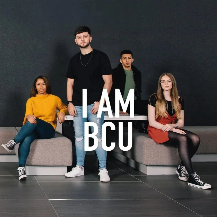
The I AM BCU campaign served as Birmingham City University’s flagship undergraduate recruitment campaign, designed to attract prospective students and showcase the institution’s unique identity.
At the heart of the campaign was the insight that BCU’s student community is exceptionally diverse, with each individual bringing their own inspiring story, ambitions and motivations for pursuing higher education. The creative approach celebrated these personal journeys, highlighting how education can transform opportunities for students and their families.
A secondary objective was to showcase students’ pride in the University’s outstanding facilities and its strong connection to the city of Birmingham. To reinforce this message, photoshoots were staged both within the University’s campuses and at iconic locations across the city. The final shoot took place on Floodgate Street in Digbeth, where we coordinated a road closure to create a dynamic environment for students, staff and photographers, enabling us to fully realise the creative vision.
The project required end-to-end creative leadership and a broad range of design and project management skills. My responsibilities included art directing photoshoots, developing typographic and layout solutions, managing external suppliers, and overseeing the production and artwork of campaign materials across multiple channels.
The resulting campaign delivered a distinctive and authentic representation of the BCU experience, successfully engaging prospective students while strengthening the University’s brand presence.
In 2024, KPMG partnered with Bentley Motors to produce the company’s Sustainability Report, a comprehensive publication covering every aspect of Bentley’s sustainability journey, from responsible supply chain management to the environmental performance of its manufacturing facilities.
I was tasked with designing an interactive and fully accessible digital report that showcased Bentley’s commitment to innovation and its progress towards achieving carbon neutrality. A key objective was to place people at the heart of the narrative, highlighting the individuals driving sustainable change across the organisation while reflecting Bentley’s wider environmental ambitions.
The creative approach combined striking automotive and portrait photography with layered imagery inspired by natural materials and textures. Supported by bold typography and dynamic layouts, the design brought complex sustainability content to life in a visually engaging and accessible format.
The resulting publication successfully communicated Bentley’s sustainability vision and achievements, balancing innovation and environmental responsibility while remaining true to the premium quality and heritage of the Bentley brand.
For Birmingham City University, Clearing is one of the most significant and competitive periods within the student recruitment cycle. Leading the creative development of the University’s Clearing campaign was both a challenging and highly rewarding opportunity.
The campaign concept focused on the emotional experience of students navigating the Clearing process. Drawing on audience insight and research, the creative approach acknowledged the uncertainty and anxiety that many prospective students face, while providing reassurance that they were not alone. The messaging positioned BCU as a supportive and welcoming institution, committed to helping students find the right course and providing the guidance they needed to move forward with confidence.
The campaign was delivered across a wide range of channels, including web, digital advertising, social media, print and outdoor media. Its development encompassed the entire creative process, from analysing research and defining the campaign strategy, through to concept creation, visual development, photography art direction, and the production of final artwork for both print and digital platforms.
The result was a cohesive, student-centred campaign that connected with prospective applicants on an emotional level while reinforcing Birmingham City University’s reputation as an accessible, supportive and inclusive institution.
The brief was to develop a sub-brand identity for KPMG’s 10by30 philanthropic initiative, an ambitious programme focused on economically empowering 10 million disadvantaged young people by 2030.
For this creative route, I centred the concept on the transformative impact the initiative would have on individual lives, while also communicating the scale of change that could be achieved when those individual successes are multiplied across millions of young people worldwide. The visual approach sought to balance personal stories of empowerment with the collective impact of the programme’s long-term goals.
The resulting identity was designed to be flexible and scalable, ensuring consistent application across a range of touchpoints. The brand system was successfully adapted for PowerPoint presentations, email communications, printed reports and promotional merchandise, including t-shirts.
The outcome was a distinctive and versatile visual identity that effectively communicated both the human and global dimensions of the 10by30 initiative, while remaining aligned with KPMG’s wider brand values and objectives.
Hosted at London’s Design Museum, KPMG’s Trust in Tech event explored the transformative potential of artificial intelligence and emerging technologies. Bringing together industry leaders and experts, the conference addressed one of the most significant challenges facing organisations today: how to embrace technological innovation with confidence while effectively managing the associated risks.
As the lead designer for the event, I was responsible for developing and delivering the complete visual identity across all touchpoints. The creative concept centred on a dynamic, animated microchip motif that rotated and pulsed to represent the energy, connectivity and constant evolution of modern technology.
This visual element formed the foundation of the event’s look and feel, providing a cohesive thread across both digital and printed materials. Its consistent application created a distinctive and engaging brand experience, seamlessly connecting every stage of the attendee journey—from pre-event communications and presentation assets to on-site graphics and supporting collateral.
The result was a visually impactful and highly cohesive event identity that reinforced the conference theme while maintaining alignment with KPMG’s wider brand standards.
This was a highly rewarding and strategically significant project, delivered through a combination of external agency research, extensive stakeholder collaboration, and the development of a suite of bespoke brand guidelines for all 17 schools within the University.
Working closely with colleagues across the institution, we undertook a detailed discovery process to identify the unique target audiences, key differentiators and individual personalities of each school. These insights informed the development of tailored creative concepts, visual identities and comprehensive style guides that enabled each school to communicate more effectively while remaining aligned with the overarching University brand.
The project also involved commissioning and art directing dedicated photography for each school, ensuring that the visual assets authentically reflected their distinct character and appeal.
The outcome was a flexible and audience-focused brand framework that empowered the University to engage with a diverse range of prospective students and stakeholders through more targeted messaging and tailored visual communications. This has enabled each school to strengthen its individual presence while benefiting from the recognition and credibility of the wider University brand.
A commemorative visual identity was commissioned to celebrate the 175th anniversary of the Birmingham School of Art, an institution that remains a significant part of Birmingham City University’s heritage and creative legacy.
Drawing inspiration from Victorian tile patterns, a reference to the School’s founding in 1843, I developed a distinctive visual identity comprising a bespoke logo, graphic device and colour palette. The design successfully balanced a sense of history and tradition with a contemporary aesthetic, creating an identity that felt both celebratory and relevant to modern audiences.
The identity was applied consistently across a wide range of physical and promotional materials, including large-format banners, floor graphics, pull-up displays, event booklets, tote bags and commemorative pin badges. This cohesive approach ensured a strong visual presence throughout the anniversary celebrations and helped reinforce the School’s rich history and enduring influence.
The result was a memorable and versatile identity that honoured 175 years of artistic excellence while strengthening engagement with students, staff, alumni and visitors.
The University of Bath commissioned a new visual identity for its campus shop, with the objective of creating a brand that reflected the store’s convenience, broad product offering and commitment to ethical sourcing.
The creative solution centred on a simple monochrome colour palette, paired with engaging and humorous messaging that gave the brand a distinctive personality. This combination helped create a friendly, approachable and contemporary identity, while reinforcing the shop’s ethical credentials and values.
Designed to stand out within a busy campus environment, the new identity was applied across a range of customer touchpoints, creating a cohesive and recognisable brand experience. The result was a distinctive retail brand that successfully differentiated the store, increased its visibility and strengthened its appeal among the student community.